How to Make Your Blog Better is a three part series based on our analysis of thousands of blogs in the BrandBacker network. We know which blogs brands love and chose to partner with, and which blogs fall flat and get lost in the crowd. Part 1 of this series focuses on the basics of design. Stay tuned for parts 2-5 for advice on creating content, increasing traffic, and managing sponsorships.
Whether you are just starting out or looking to revamp your blog there are a few organizing principles that can transform a blog from average to exceptional. Our focus for today is site design 101, which is quite likely the biggest decision you make when setting up your blog.
DESIGN
Here at BrandBacker, it only takes a minute to differentiate a good blog from a great blog. It starts with the visual. Great blog design is clean, clutter-free, and easy to navigate. When a blog has an open feel, it invites the reader without any distracting patterns or jumbled sidebars. The biggest tip here is to not be afraid of white space, because it lets the content speak for itself. Adding in a simple color scheme of 2-3 colors keeps your theme visually cohesive, but not overwhelming. Too many blogs have compelling voices buried under bad design, so don’t let your love of butterfly wallpaper scare away readers.
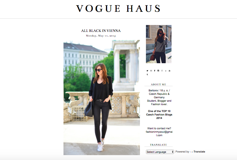
Check out this clean, minimal design from BrandBacker user Vogue Haus.
LAYOUT
Great design lends itself to functionality. To keep it simple, your navigation bar should have only 6-8 categories so that a reader can find what they’re looking for in no more than two clicks. The same goes for keeping sidebars streamlined. To ensure that your sidebar fits with the rest of your blog, have a rule about widgets, ads, and badges. Make sure that they serve a purpose for your readers and that they work with the rest of your design. Increasing your social followers is important but having multiple follow buttons can feel like you’re bombarding your readers. A good bet is to place your social follow buttons on the top right, together and all in one place.
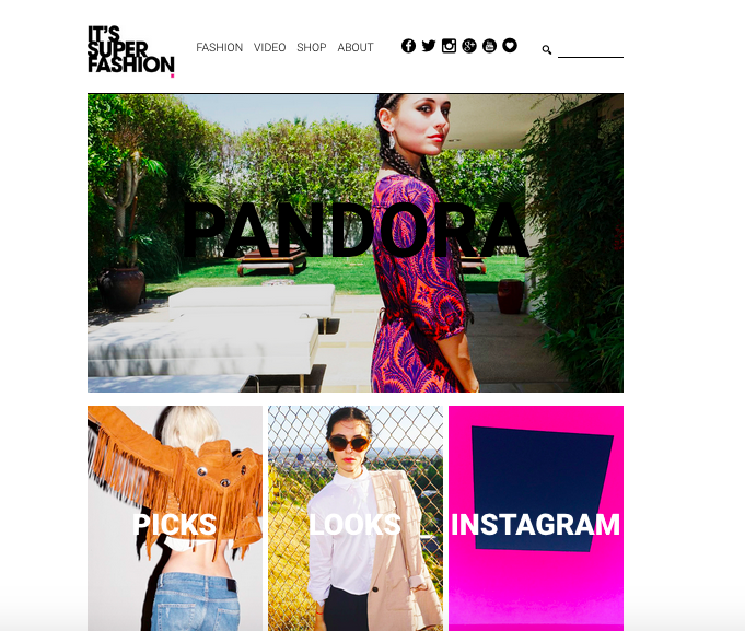
Check out this great menu and social organization from BrandBacker user IT’S SUPER FASHION.
Now that you know the basics to setting up a super sleek site for your users, it’s time to review and make some tough decisions. While your current color palette may fit your personality or perhaps you’re convinced that there’s no such thing is to many widgets; remember that the true value of your site is content. How will you make it look best?
